25 Feb 2019
Smashbomb Has Had A Makeover….
Not too long ago, we let you have a sneak peek at our new look! Well the time has come for Smashbomb to evolve, making it bolder and better than ever before.
We’ve been busying ourselves making Smashbomb brighter, more colourful and more intuitive for Smashbombers, and we’ve had some breakthroughs in our design.
Let’s start with the first page you arrive to when you come online;
The Home Page
Your Home page stream will show you the same types of posts that it did before; reviews, things to rate, comments, images and videos, and so much more, but what you will notice has changed is the sidebar and the fact that all the images on the page are much bigger than before. With a few splashes of colour here and there, and the increased image size, we have aimed to have less of the dulling greys and whites and a little colour.
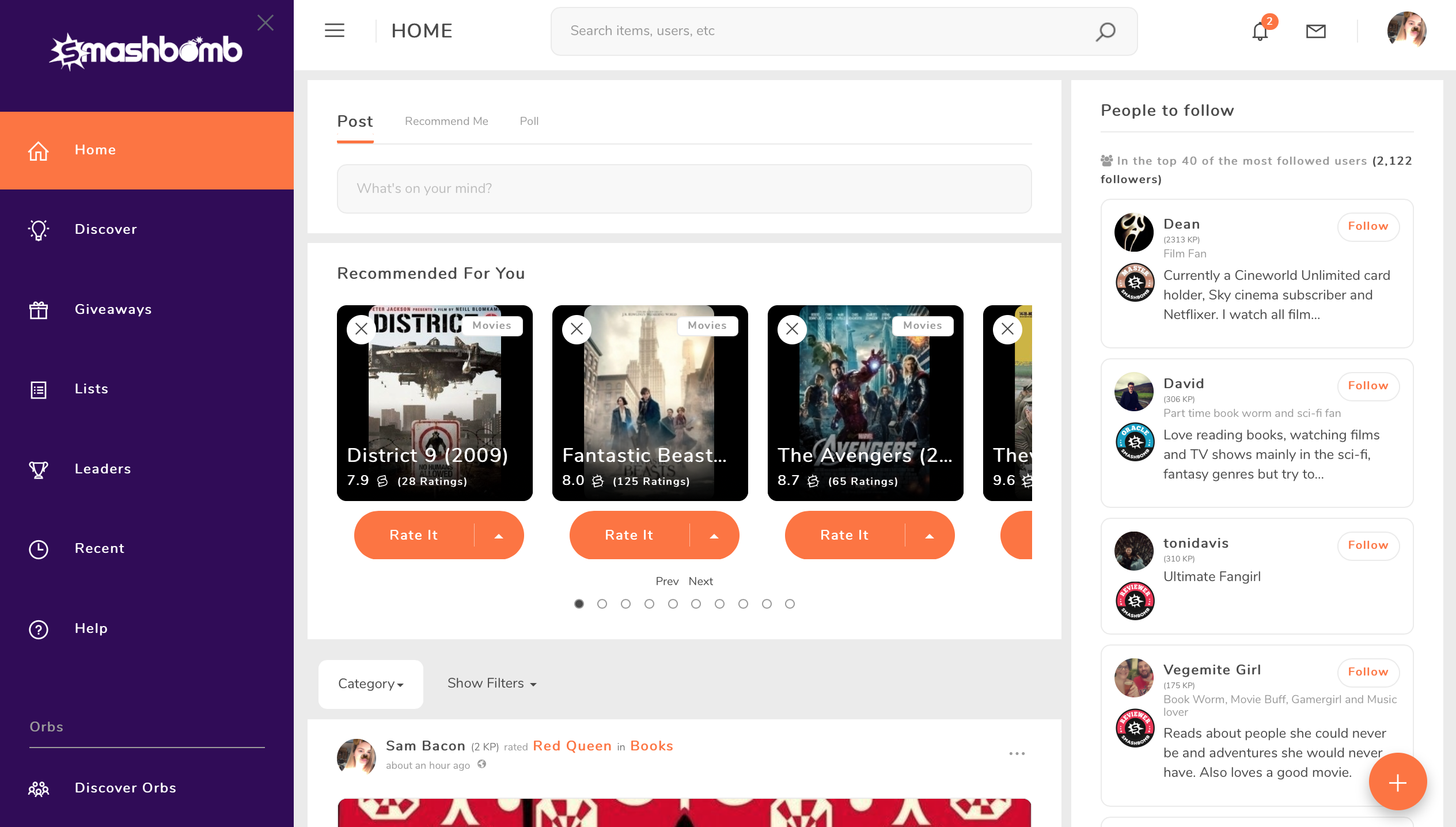
We have also spruced up user ratings, reviews, comments and other posts. When a user rates or reviews an item now, the item images are shown along with the review (if the item has images) and we have a new way of showing good bits and bad bits of an item.

The Discovery Page
You’ll notice that the images on the Discovery page are much bigger and on each item image, the average rating and number of ratings are shown. We have also added a banner at the top of the page that will display featured items.
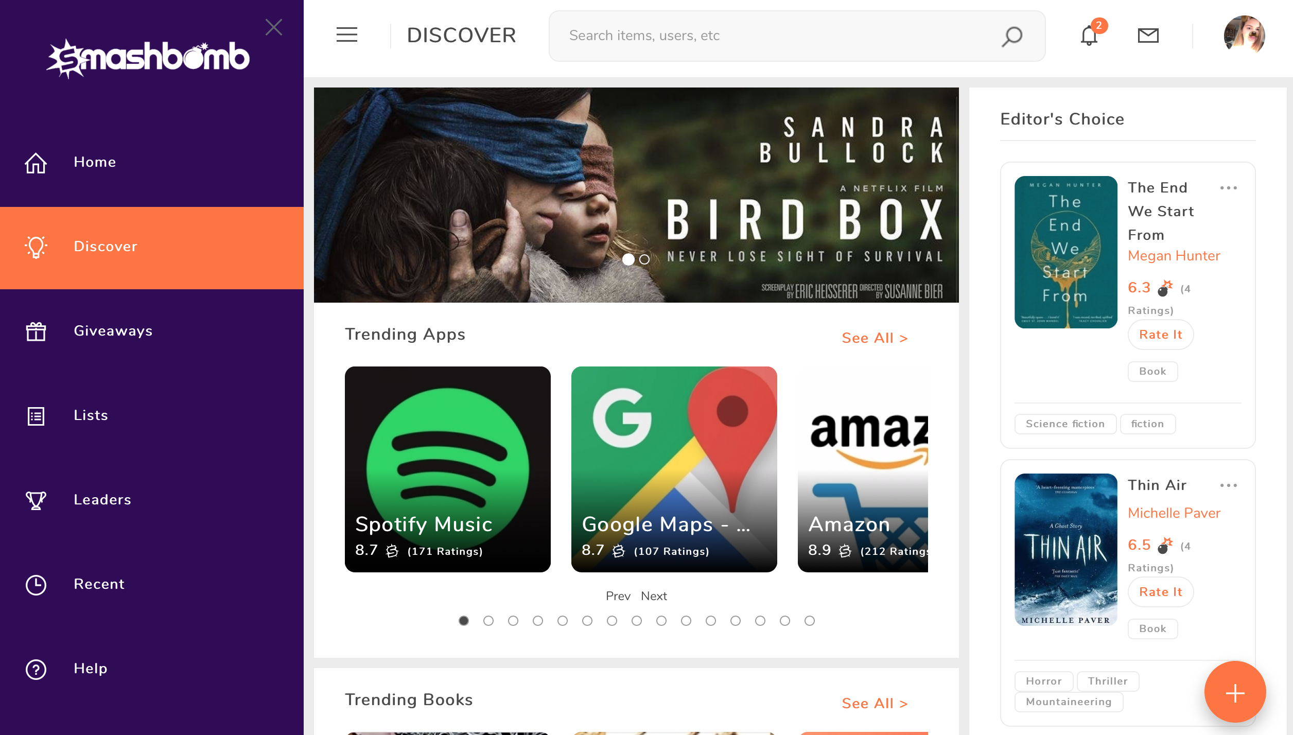
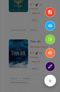
At the side of the Discovery page you will see selected Editors Choices, and like on every page you will see our ‘Add’ button. You can use this button to;
- Add new items
- Create a new Orb
- Add a new List
- Start a new review
- Create a new post
The Giveaways Page
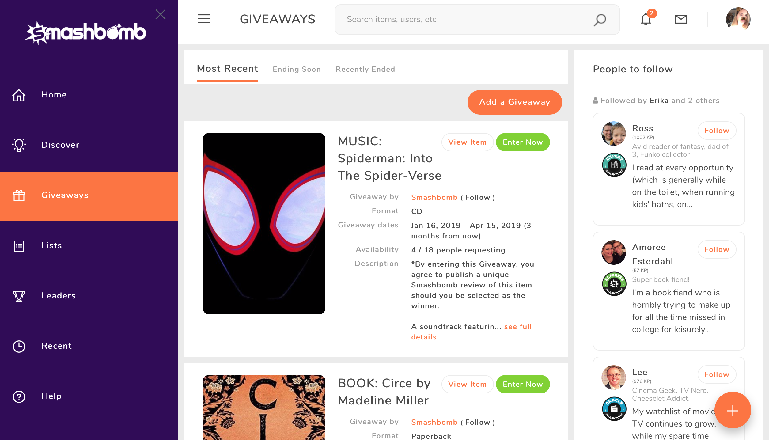
Our Giveaways page hasn’t changed too much, with the exception of some more colour and bigger images, you can still enter all your Giveaways and request to start a Giveaway in one place.
Lists Page
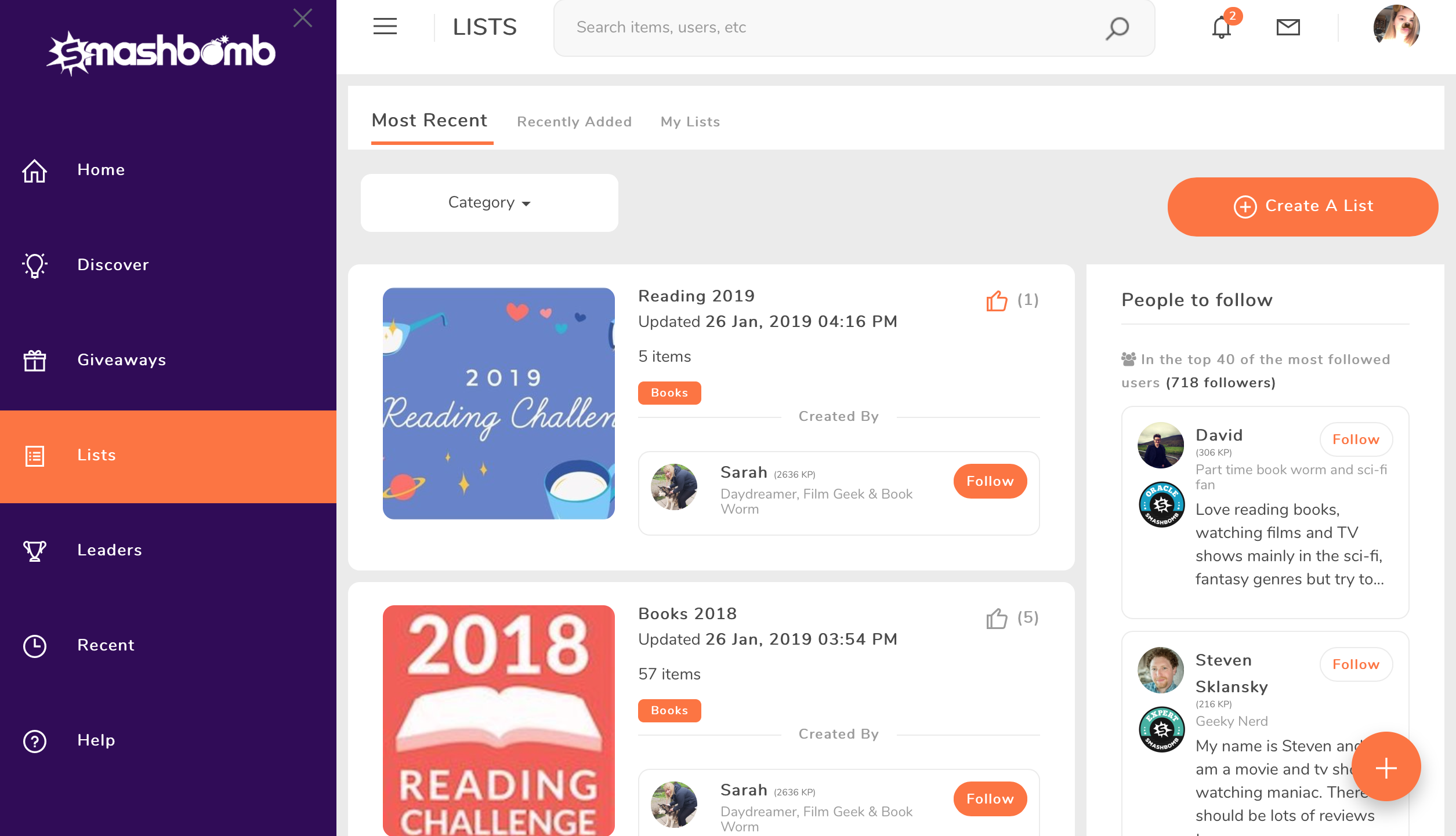
We love a good list here at Smashbomb HQ and we love the look of our new Lists page. All lists will show a bigger image and give you an easier way to follow the creator of a the list. We’ve also made it a little easier to create those wonderful lists; with a big, bright and bold button for you to click!
Leaderboards
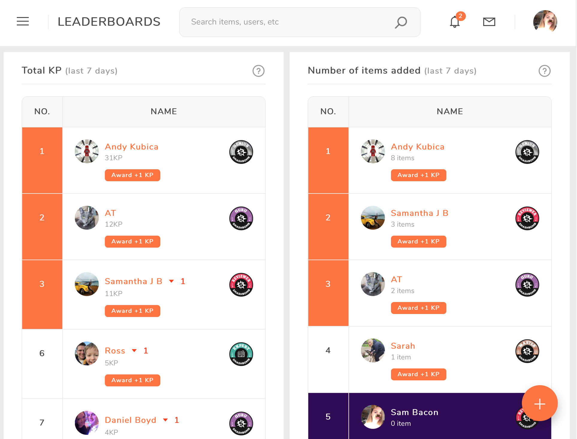
As always, we want to let you know when you’re contributing to the community, so we have kept our Leaderboards the same. You will still be ranked on KP, items added, items rated and more, the only change is the colour scheme of the page.
Orbs
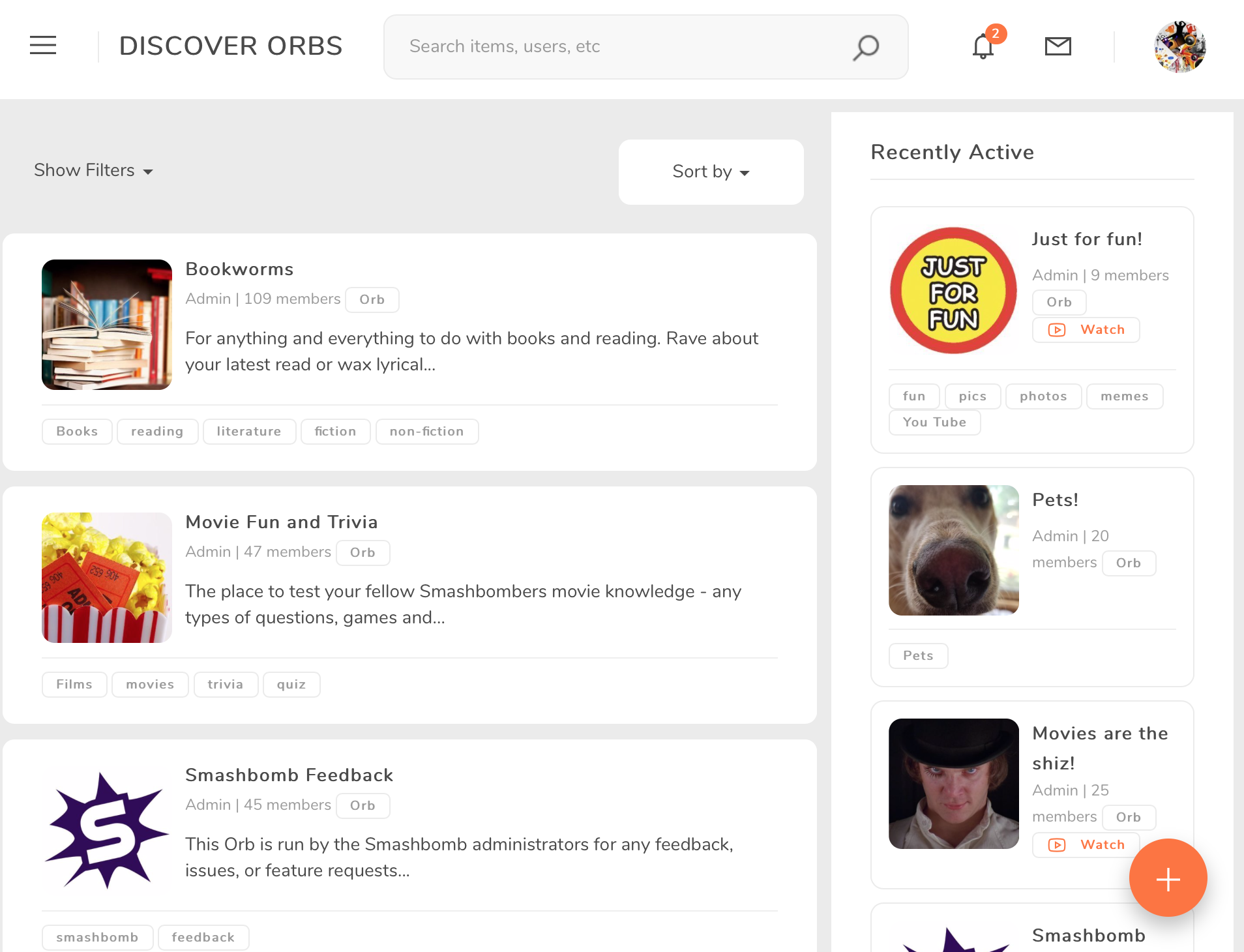
Now Orbs haven’t changed much at all, but like every other page we have increased the size of videos and images and added more colours.
Item Pages
The item discovery pages have had a little bit of a re-vamp, with the images growing and bold colours. On the top of popular item category discovery pages, we have featured item banners.
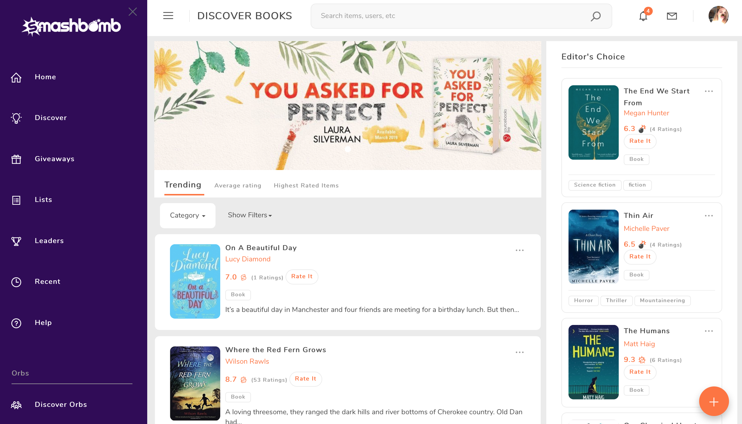
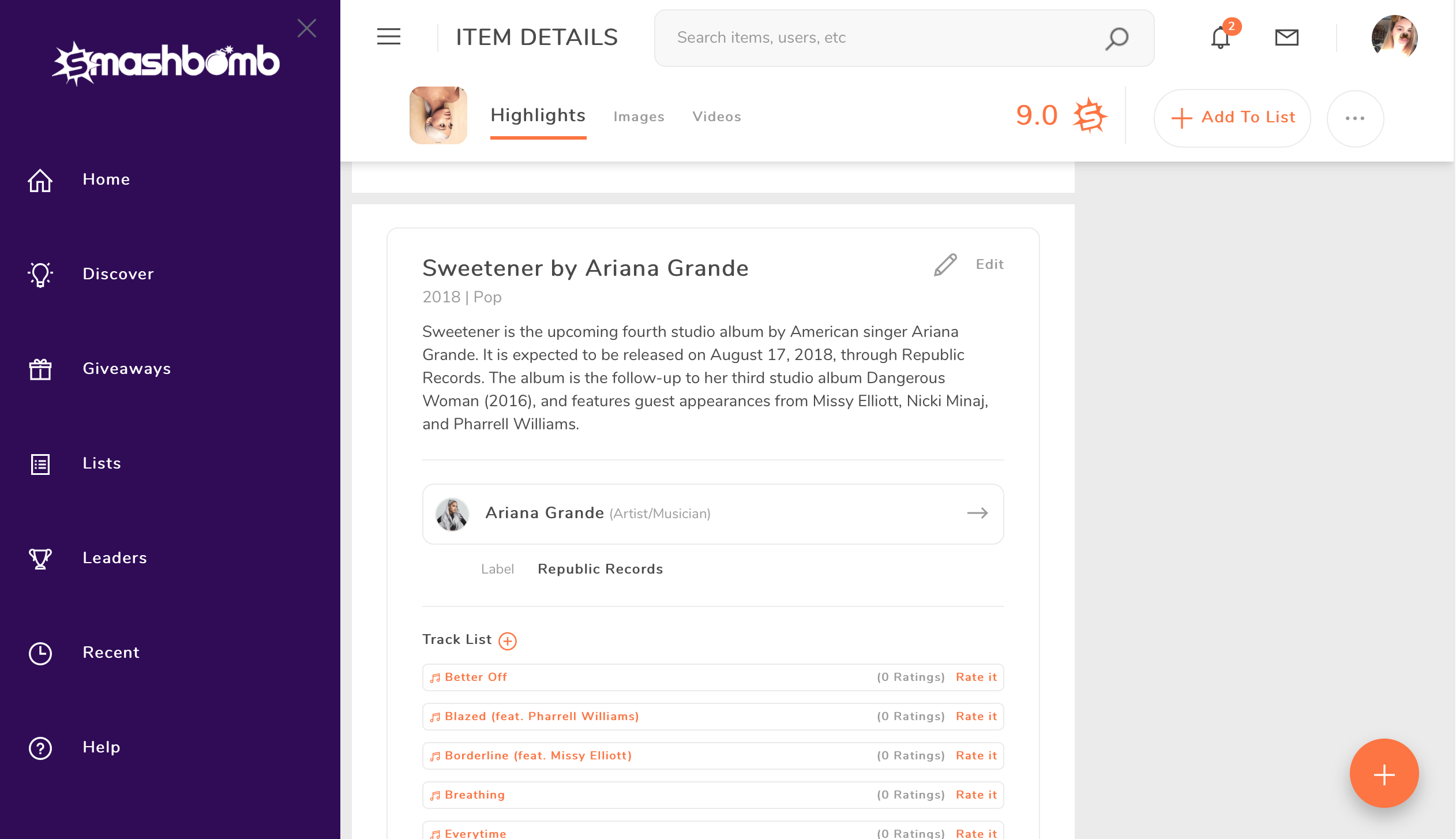
On each item page, there are a few differences that you can see. The images and videos are much bigger and the way you edit items has changed. The item pages are a part that have changed a lot and we think you’ll love it!
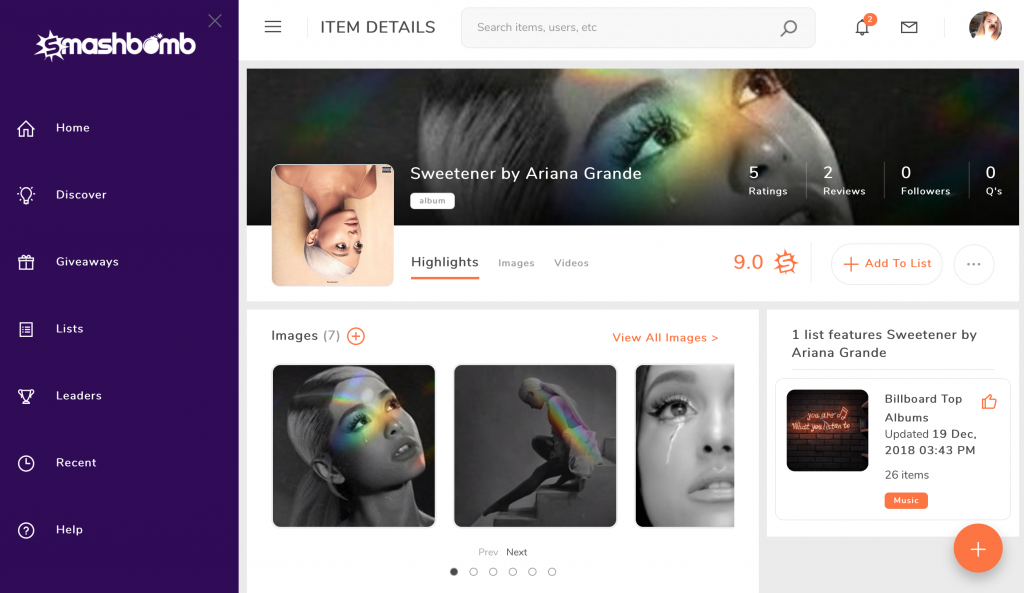
On the item page you can do everything you would normally do, but everything is more intuitive than before.
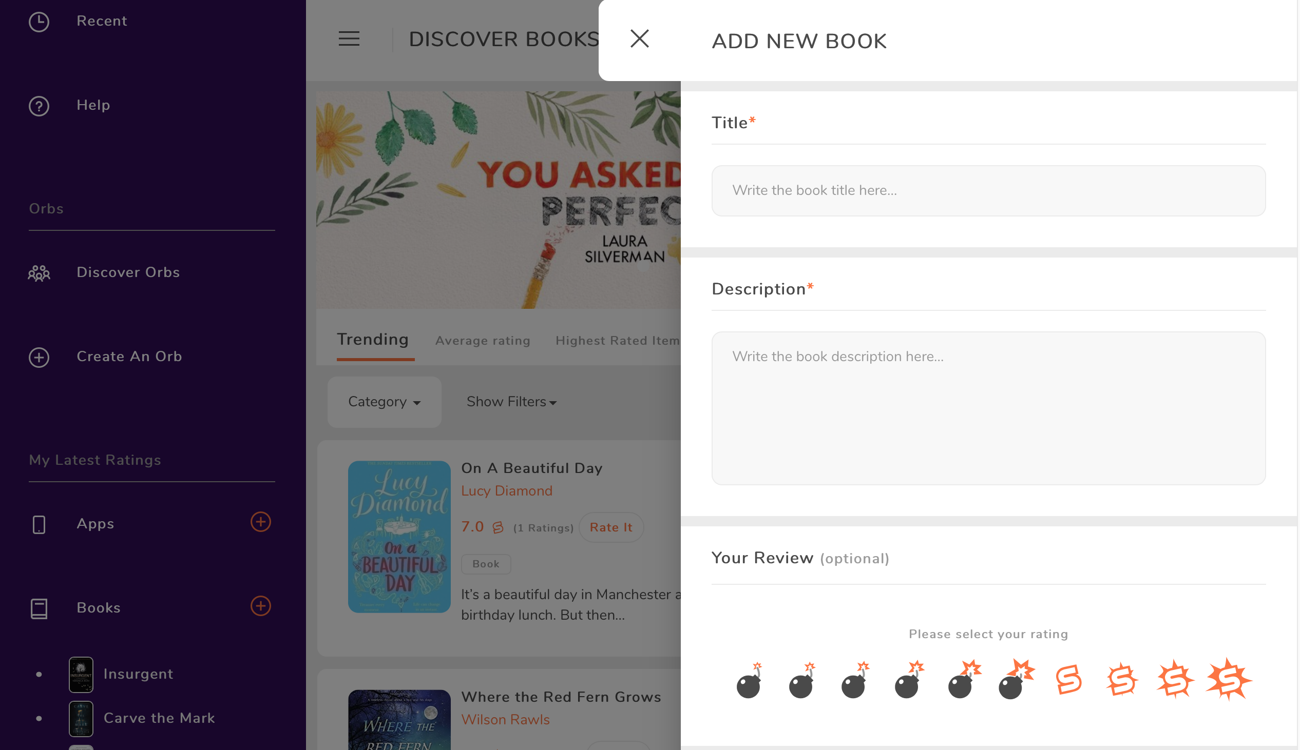
Adding an item has changed too, instead of a pop up box, the box will come from the right side of the page, where you can add the item and rate it.
Profile Pages
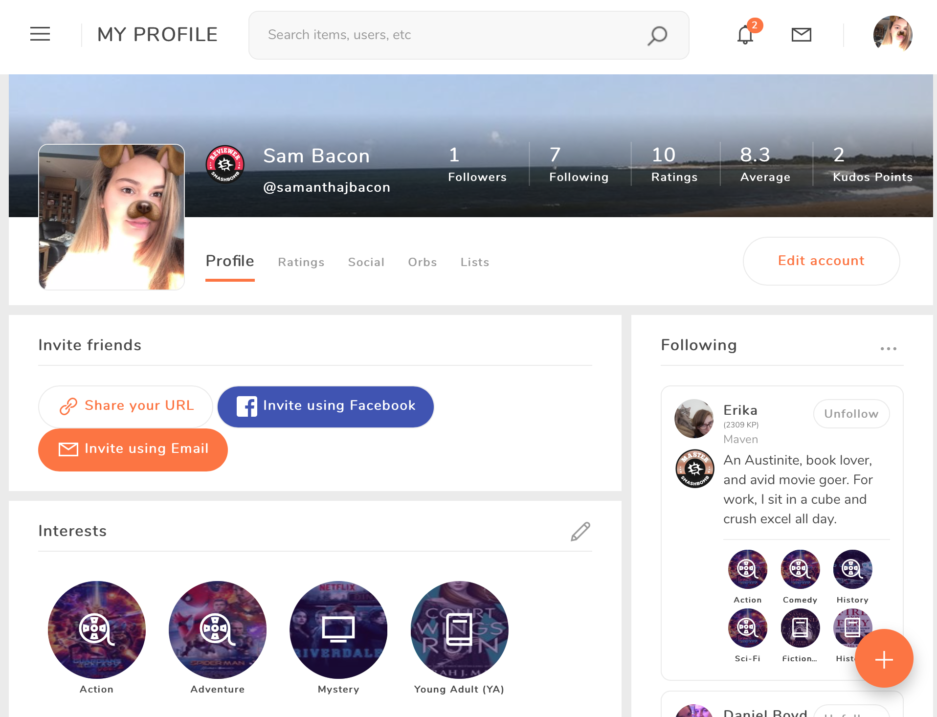
Your profile page has changed! You’ll see that each user now has interests based on the categories we have on Smashbomb and these interests will help you to find recommended items and people with similar interests.
These are some of the biggest things that have changed on Smashbomb, but there are so many other improvements for you to find.
We can’t wait to hear your throughts on our new interface…?

