19 Sep 2018
A Sneak Peek At The New Smashbomb Interface
So, as you may have noticed we have been rather quiet lately with our updates and blog posts. This is because we’ve been working hard on a new interface for Smashbomb.
This re-design is all about the visuals over any text, but still shows the important bits. You’ll notice more colors, images ,and less bulky text. Each page of Smashbomb has been fine-tuned and changed so that you have more to look at.
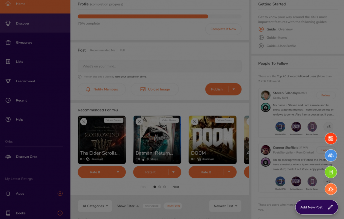
The ‘Home’ page will have the same features but will have a slightly different look. You’ll see a new floating side-menu where you can quickly do basic actions; add a new post, leave a rating, create a new Orb and more.
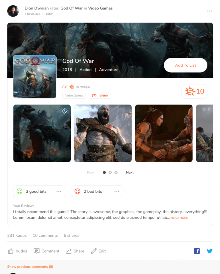
The way you see reviews on the ‘Home’ page will change massively. You’ll now see more imagery from the item thats been reviewed, and you’ll see how many positives and negatives there are to the item with the option to click to reveal them. Also, there will be a quick and easy way for you to add the item to one of your lists (perfect for your ‘Need To Read’ lists!).
The ‘Discovery’ page will show large item images and less text, but will still show item ratings. At the side of the page, you will find suggested follows and ‘Recommended For You’.
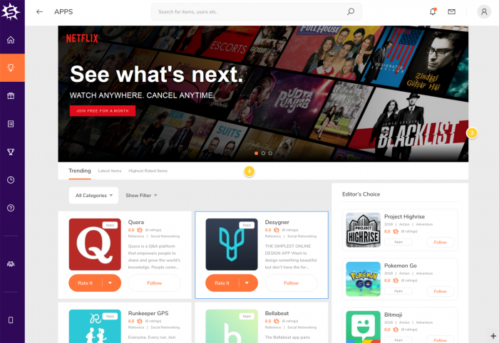
Each category page has changed as well, you’ll now see more images of trending items and you’ll be able to filter what is shown on the page using tabs at the top.
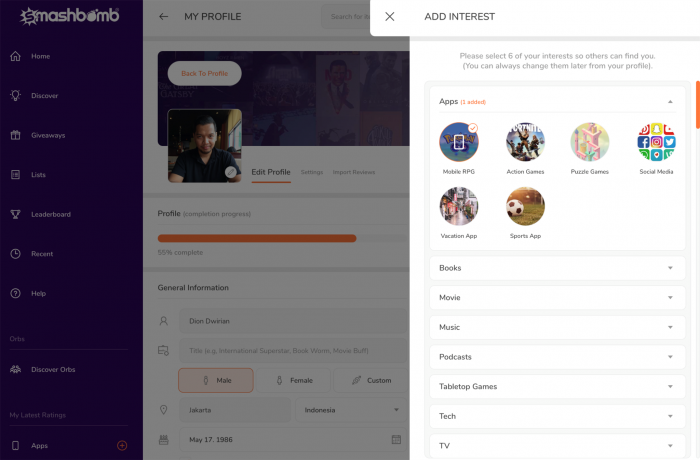
We wanted to make adding your profile easier and faster, which is why we decided to change the way you add interests a little. You’ll now have interest bubbles to choose from; each bubble will be taken from different categories. Also, we will be changing the design of your profile page and profile settings page massively to make it more intuitive and visually appealing.
And this is just a peek! Keep a look out for more about our re-design that will be launching later this year.. ?
A big thanks to all our Smashbombers as usual for all your help and support.
#Smashbombers #Rock


