13 Jan 2017
How We Selected Our Startup Logo
Smashbomb was born (read the story of how we chose our startup name here). Yay!
Now we had a name, it was time to work on the brand image (‘logo’ to you and I) for our startup. Over the years, I have been to umpteen different logo designers and have generally found the typical ‘buy three logo concepts and then revise’ a little cumbersome and restrictive. With this in mind, and to underpin our commitment to crowdsourcing, we started a 99designs competition.
For those who haven’t encountered 99designs, it is a contest-based design marketplace. You set the prize for the winner as a reward, add a design brief, and you receive a whole load of designs from freelance designers looking to secure the reward. You are then able to elect a final few and work directly with these designers to obtain your final design before awarding the prize to the winner. Win-win.
I like 99designs (I have no connection with them whatsoever) because you get a very wide range of concepts (top tip – run the contest on a ‘blind’ basis so designer ideas remain their own!), and are then able to drill down into your own requirements. It also happens very quickly – in the case of the Smashbomb logo, the entire process took less than 2 weeks.
Here was the logo design brief we used…
Smashbomb is based on a recommendation system where users can rate items out of 10.
Items with an average rating of 7 or above out of 10 are considered a ‘smash’ whereas items with an average rating of under 7 are a ‘bomb’ (to be avoided!) so the logo should have both a smash icon and a bomb icon within it.
The first S (of the word smashbomb) should be within a smash icon and the ‘O’ should be replaced by a bomb icon.
The logo must also work as a white-on-black logo, and the icons mentioned above should be custom designed (not just some clipart, etc).
The logo should be relatively simple (no tagline, etc).
The dominant colour should be a dark purple: (something like #230440). Designers should experiment with the colour of the smash icon to make it stand out, but also still work when single-color.
We had to consider that many of the designers have English as a second/third language and so simplicity and plain-talking is key. We kept it brief so as not to bamboozle designers and not to place too many restrictions upon them so their creative juices could flow whilst steering them with a clear idea of our direction.
We received around 60 designs to choose from. Most, of course, didn’t follow our brief anyway!
Here are a few examples of the initial entries we received, good, bad, and ugly…
Some great designs but we really liked the following initial concept due to its simplicity and how well it could emphasise the underlying concept of Smashbomb.
Admittedly, it needed some work – we didn’t like the style of the bomb, the font was a little ungainly, and the smash around the ‘S’ was too flat and needed more ‘oomph’!
We embarked on a process of fine-tuning the design. Here is timeline of how the logo morphed from the above original concept to the final commercial version…
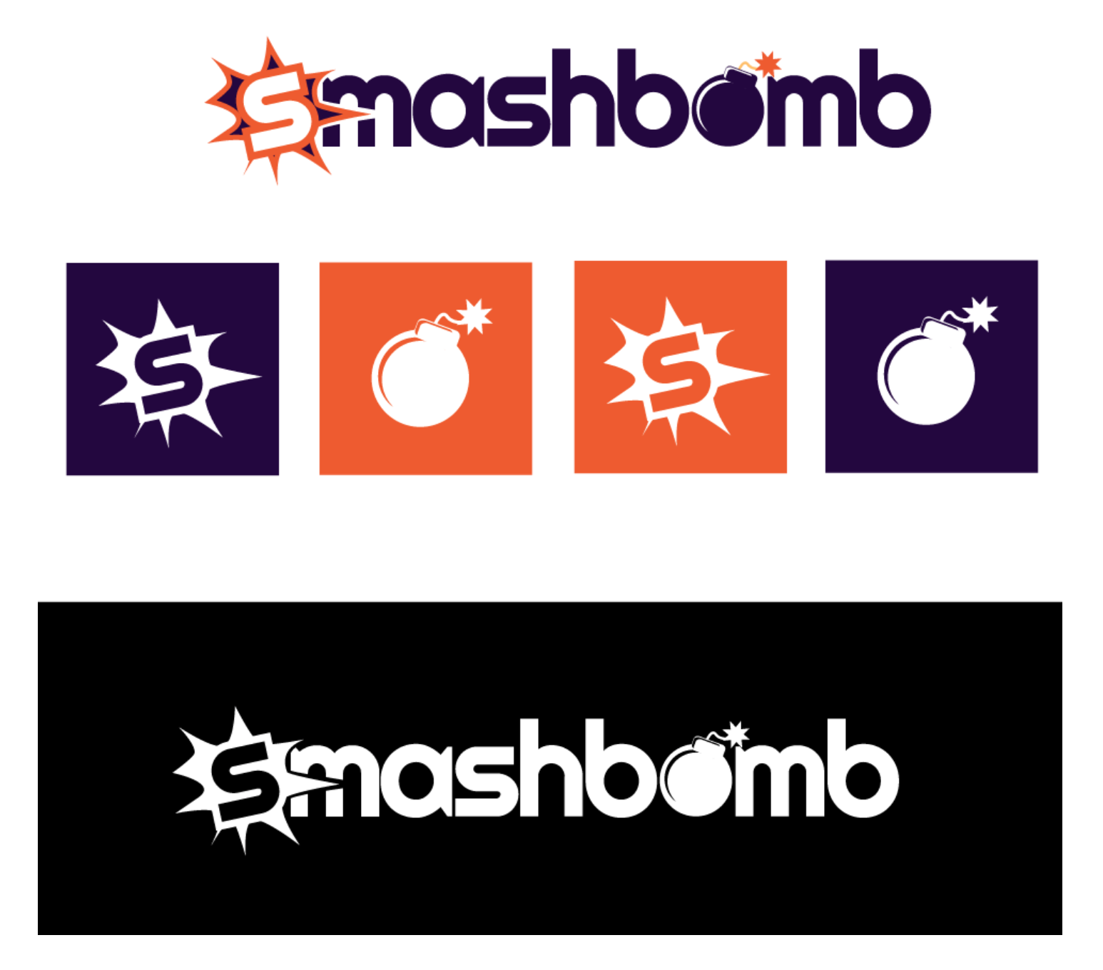
And there we had it – the Smashbomb logo. We loved the fact that the smash and bomb icons could be used directly on the website to denote the quality of an item at a glance. Also, we thought the ‘smash S’ looked great in single colour as a square icon.
This will be the basis for our branding. We hope you like it.
p.s, don’t forget to be one of the first to play with Smashbomb. Join us as a beta tester below…

